My Role: Design Strategy & Creative Direction
Agency Partner: DAVIS Agency
In-House Design Lead: Meg Farnan
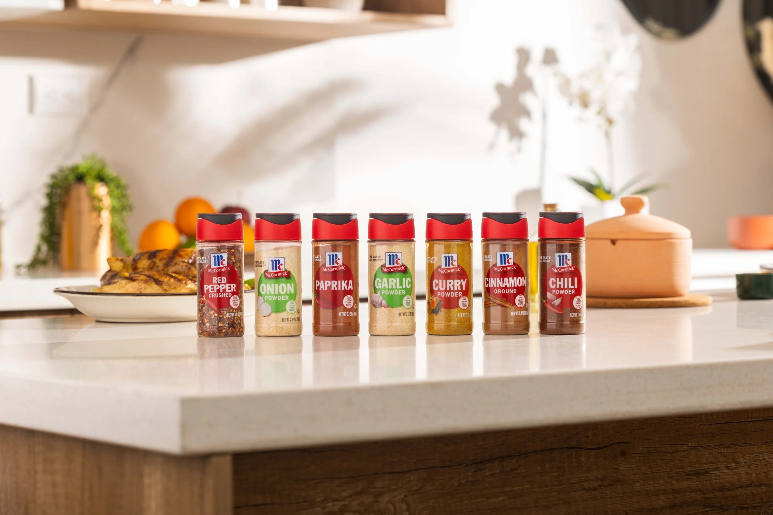
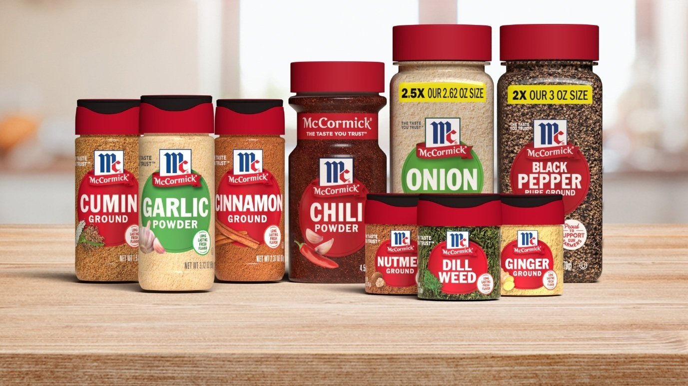
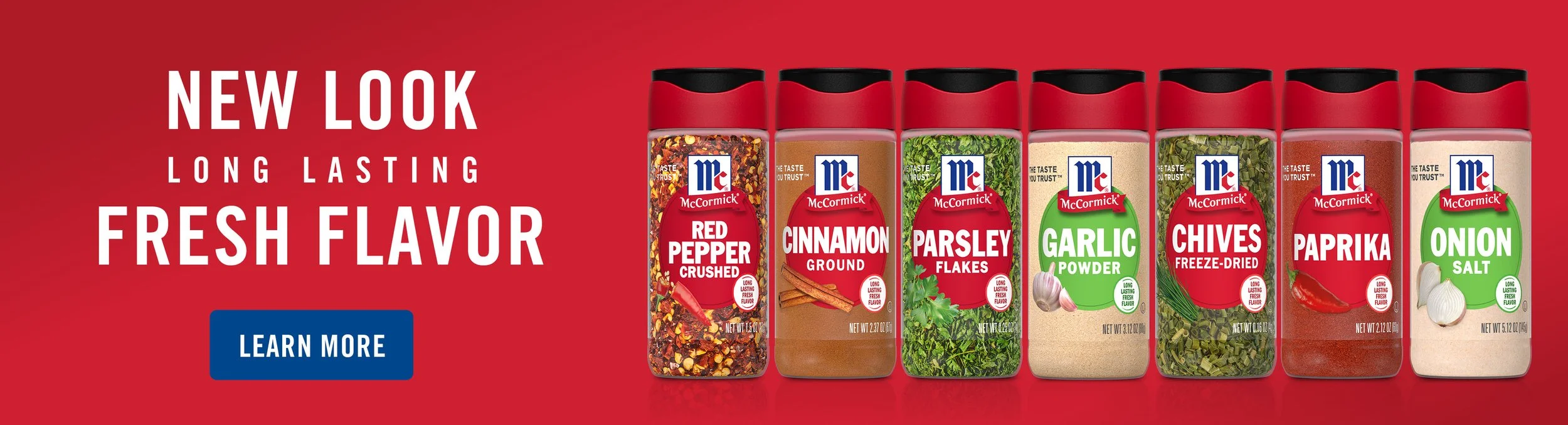
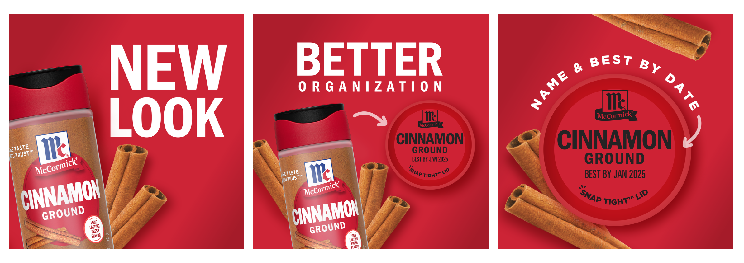
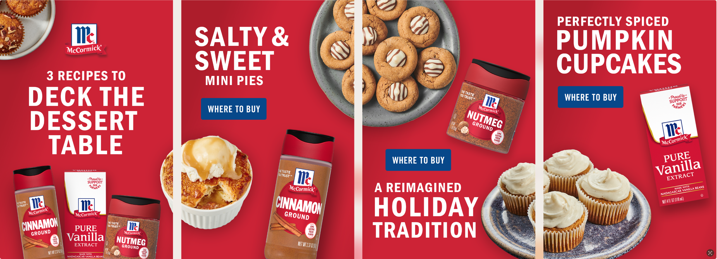
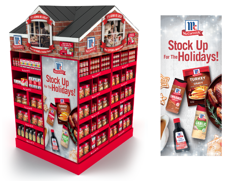
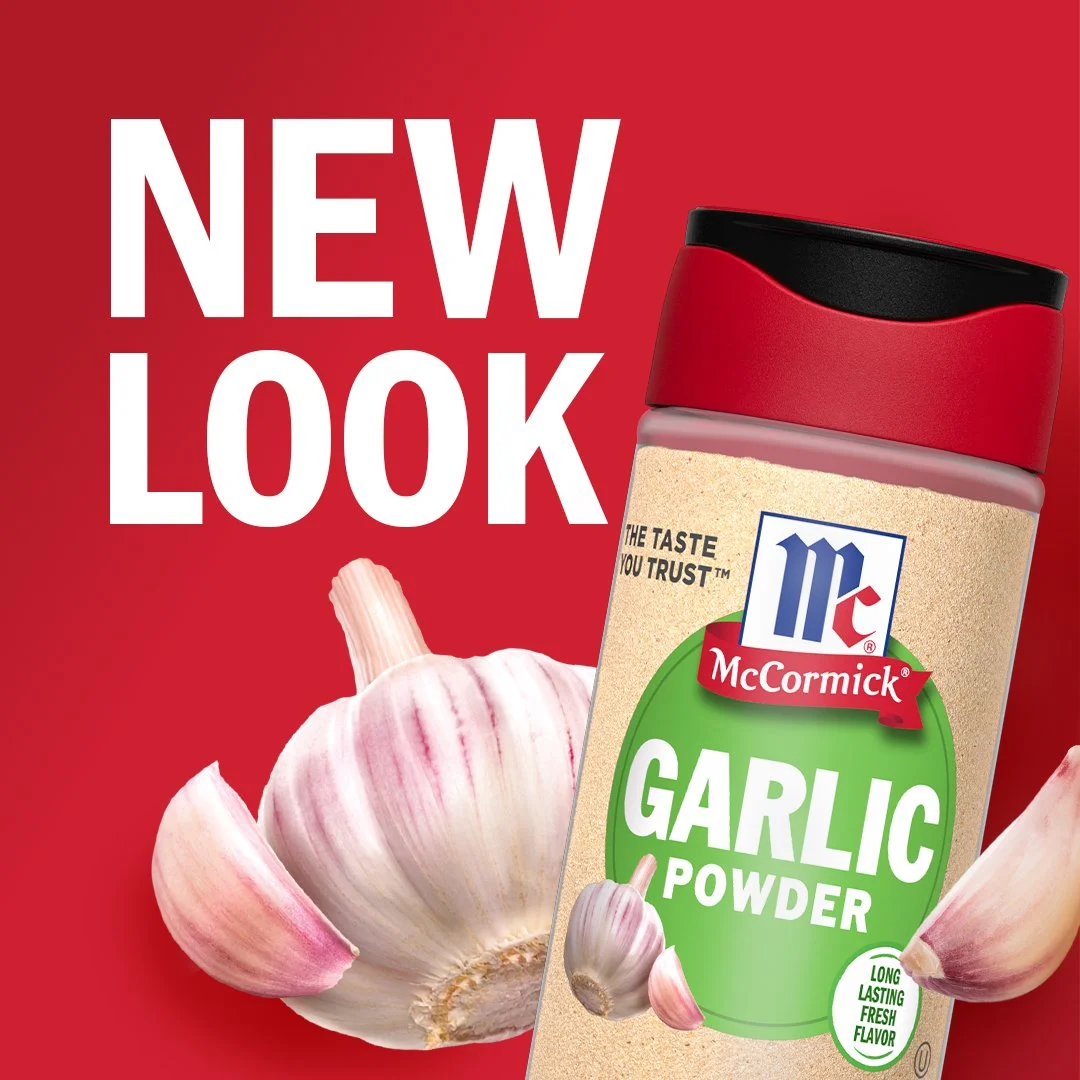
McCormick Red Cap Renovation – a fresh take on timeless flavor. In a world where quality and freshness reign supreme, McCormick embarked on a journey to redefine its signature red top packaging, a brand synonymous with the spice world. We recognized the need to embrace modernity while staying true to our heritage, striking a chord with younger consumers while retaining the trust of loyal spice enthusiasts. The result? A bold new design featuring the innovative 'SnapTight' cap, promising unrivaled freshness. We've adopted a clean, minimalist aesthetic with clear labels that allow our exceptional products to shine. The red dot with the product name and flavor cues take center stage, alongside our heritage tieing us to our roots. This revitalized look isn't just skin-deep – it's also eco-conscious, as our new packaging is crafted from 50% post-consumer plastic. Join us on a journey to discover how we breathed fresh life into our iconic red cap, securing a coveted place in today's spice cabinets and tomorrow's digital landscape.
Partnering with our agency experts, I led the packaging redesign and renovation of the graphics across 150 SKUs, translating key insights from user focus group testing into strategic design updates aimed at boosting purchase intent at the shelf.
Then we turned to our in-house team, who brainstormed, pitched and beat out even our top media agency to deliver our launch campaign and all of the digital assets associated with it.
Every single consumer touch point was considered from packaging to in-store to e-commerce to online launch, and I had the honor of leading the teams along the way.
Read More:
https://gdusa.com/packaging/mccormick-redesigns-core-red-cap-products
https://www.today.com/food/groceries/mccormick-new-spice-bottles-rcna74935
My Role: Design Manager | Agency Partner: Perspective Branding
Company: McCormick & Co.
To tap into the growing demand for healthier, more relatable flavor options, the team partnered with emerging online foodie Tabitha Brown to create a bold, personality-driven spice line. I led the creative vision and helped translate Tabitha’s vibrant personality and brand into a cohesive presence—first on shelf, then across all digital touchpoints.
Her passion for healthy living, bold flavor, and creativity came to life in a sunshine-filled, expressive design that felt uniquely hers. Initially launched direct-to-consumer, the line’s overwhelming success led to a full pan-channel expansion into retail and club stores in its second year.
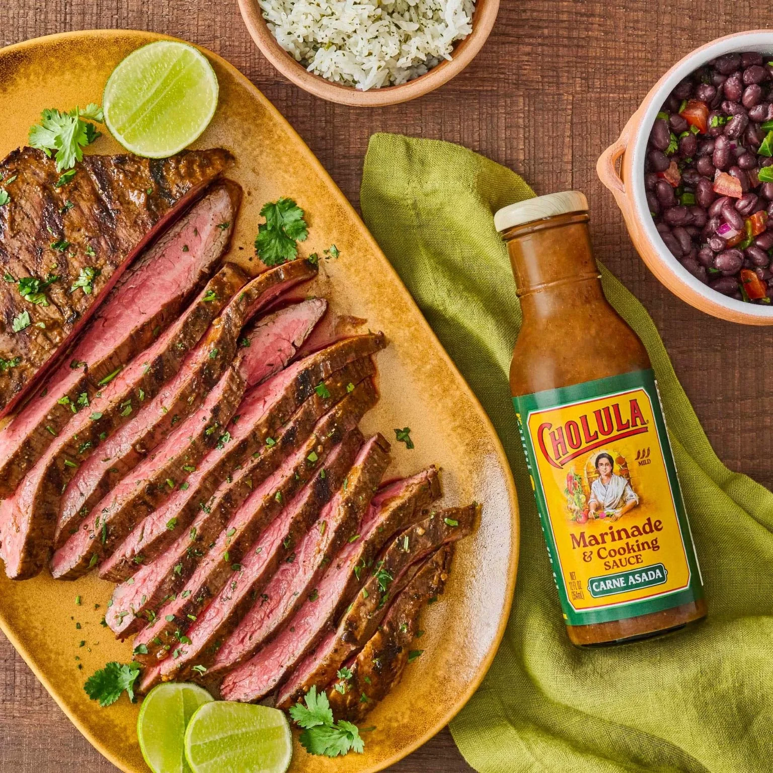
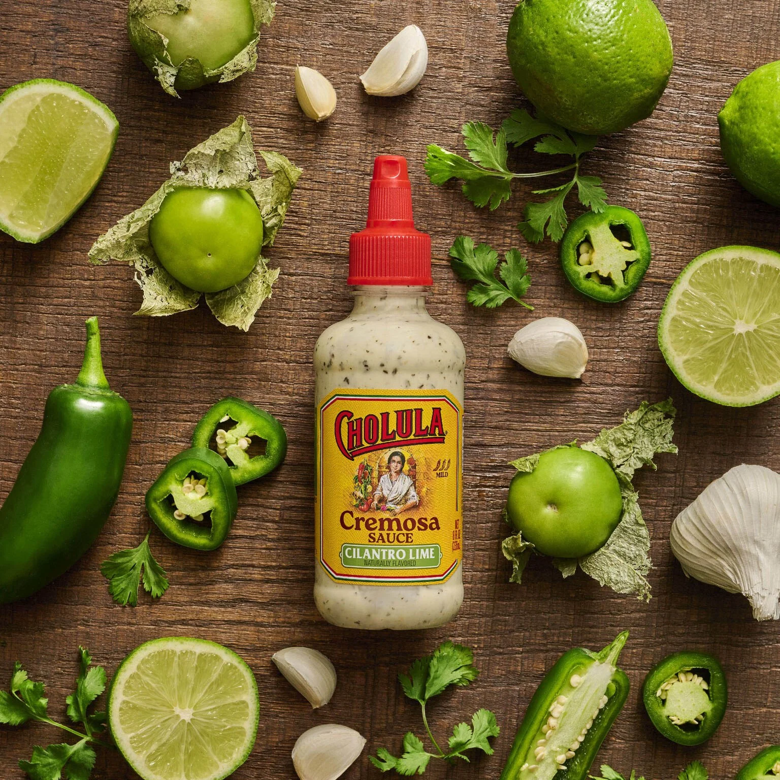
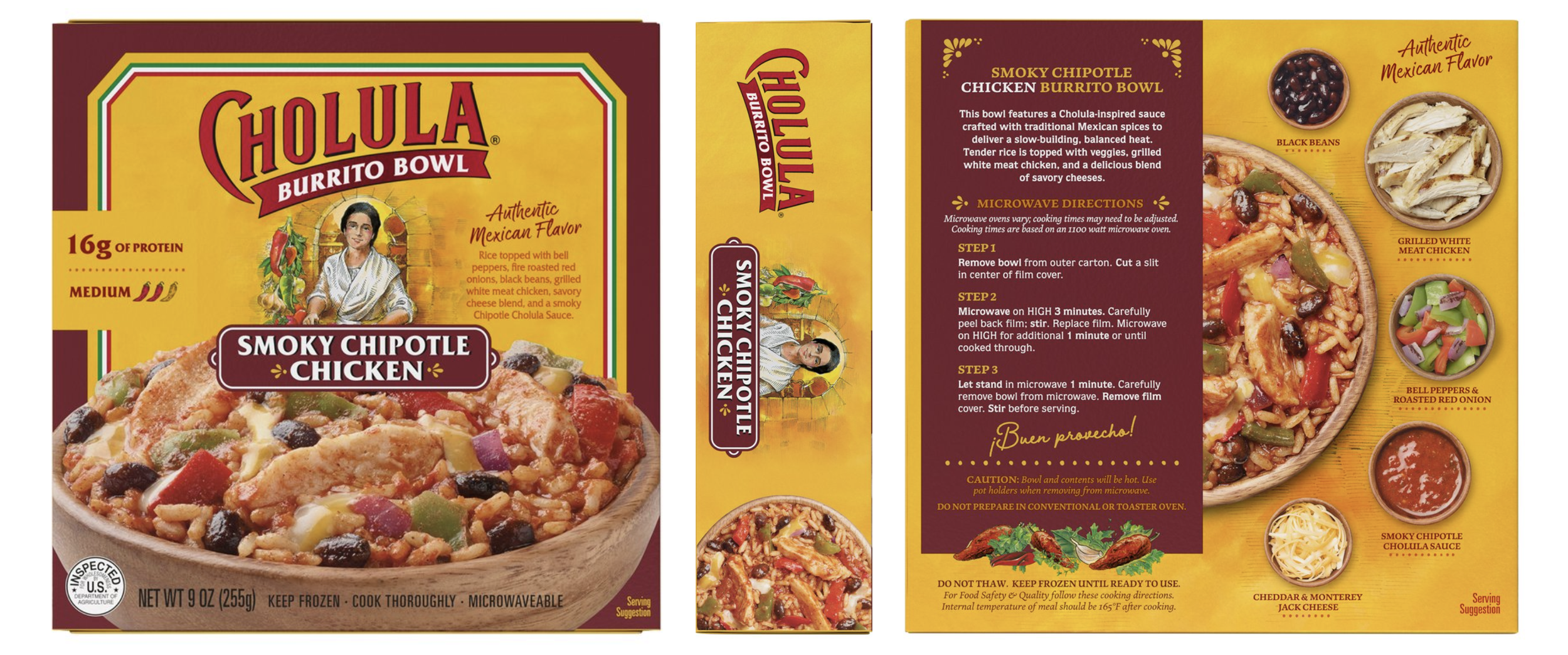
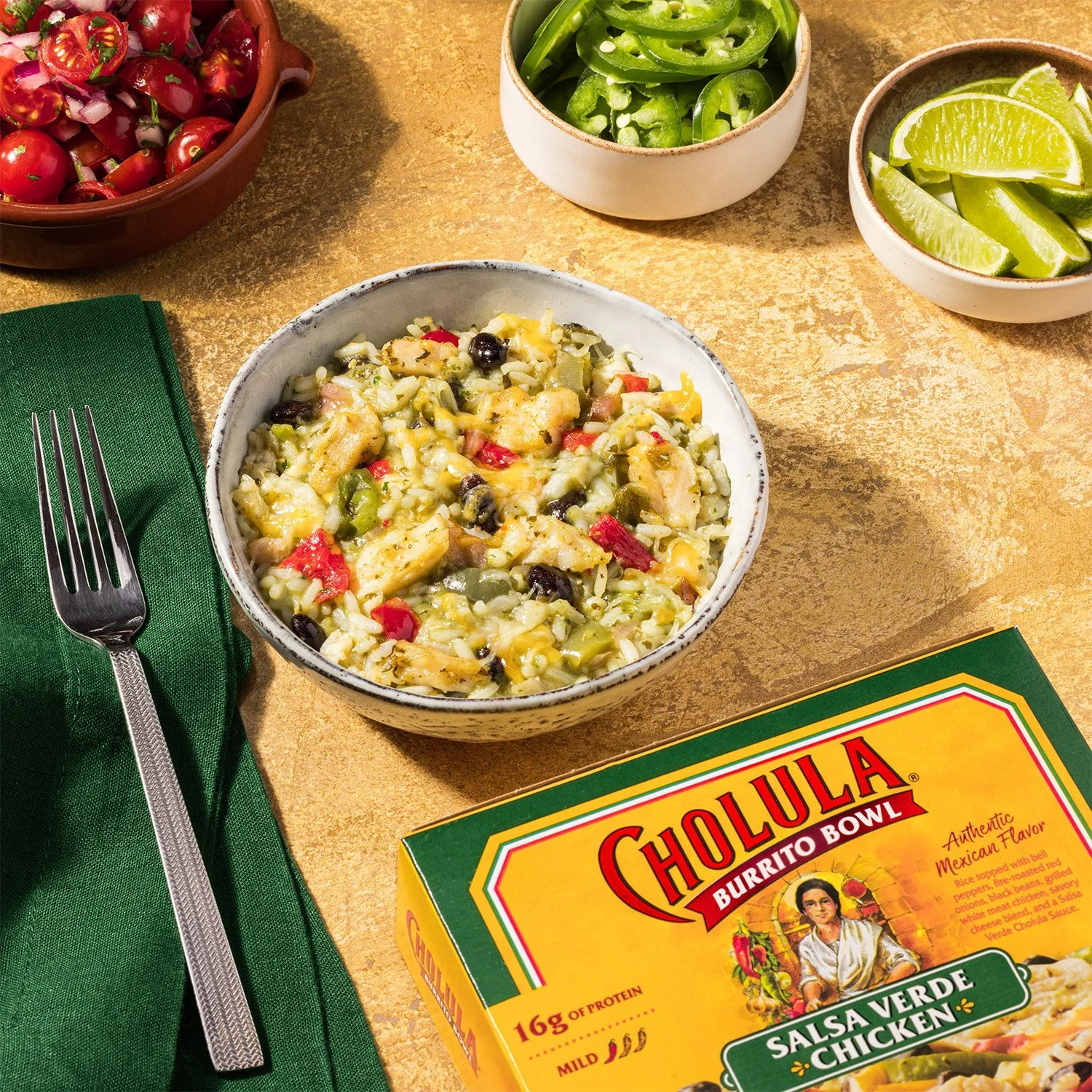
My Role: Creative Direction & Design Strategy
Agency Partner: Bridgemark
In-House Design Lead: Meg Farnan
Company: McCormick & Co.
Insight: How recognizable was the beloved hot sauce brand when it stepped outside of the hot sauce aisle? Could we leverage the key visual equities and gain brand recognition across the store?
Solution: By partnering with insights, we developed a range of testable design system options and conducted focus groups with consumers to validate how recognizable our beloved hot sauce brand was. We learned the key visual equities that needed to be carried over into the design system as we expanded across the store and into new categories. This set the team up to execute new product innovation and advertising campaigns quickly, as well as expand with our global partners in new markets.
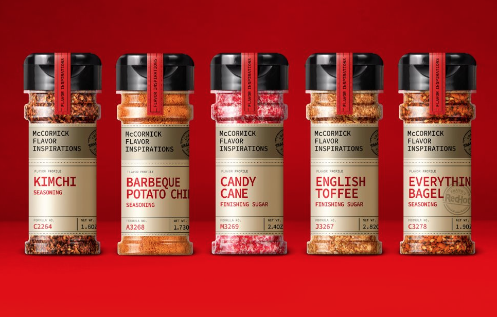
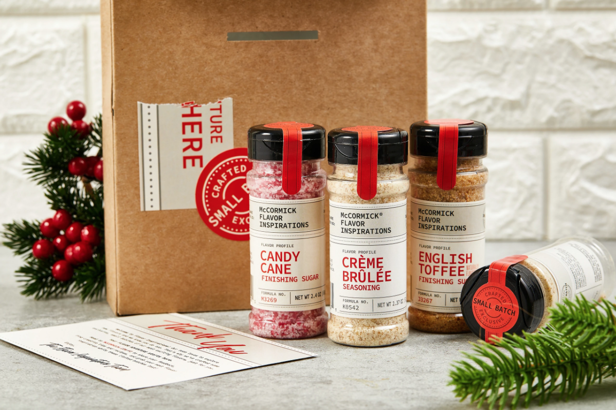
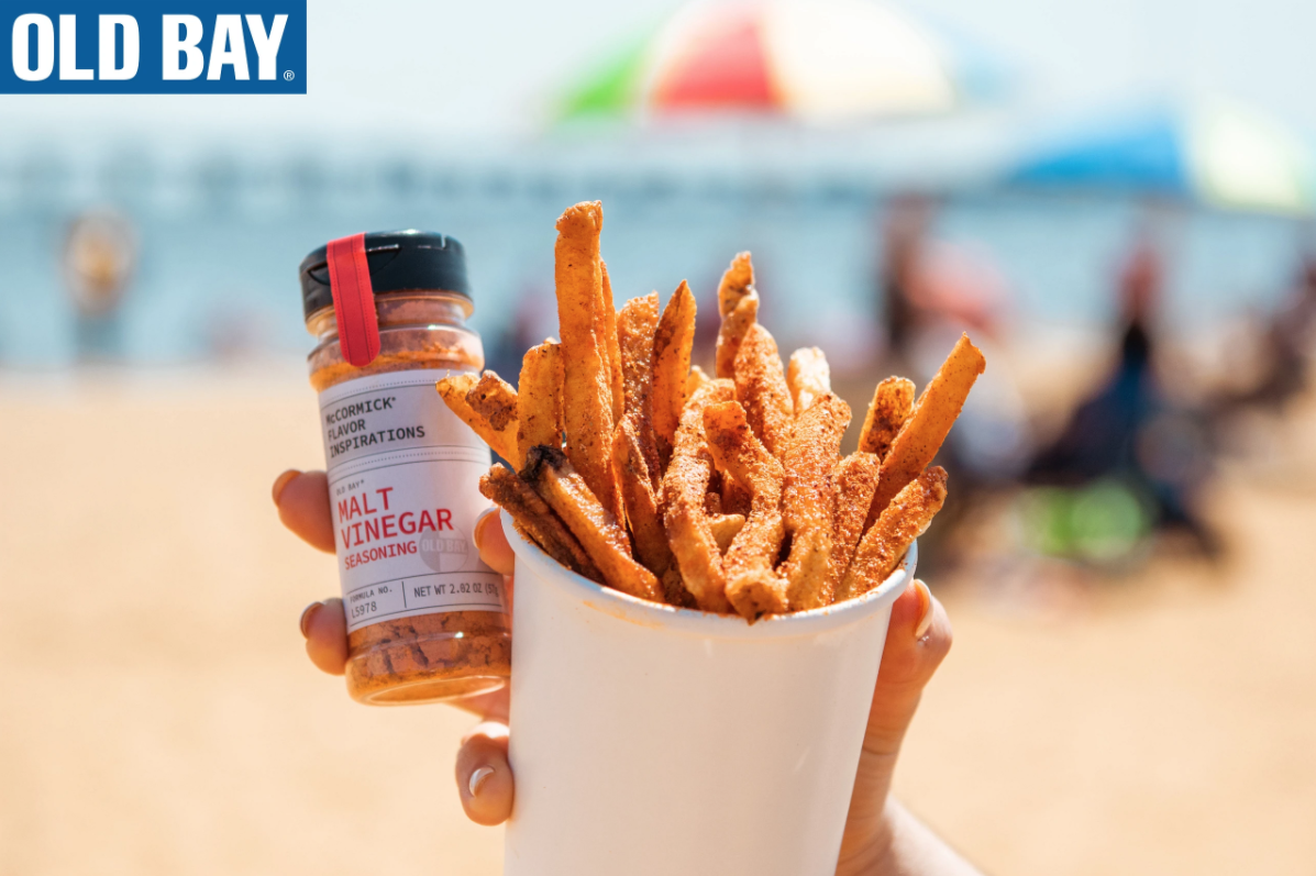
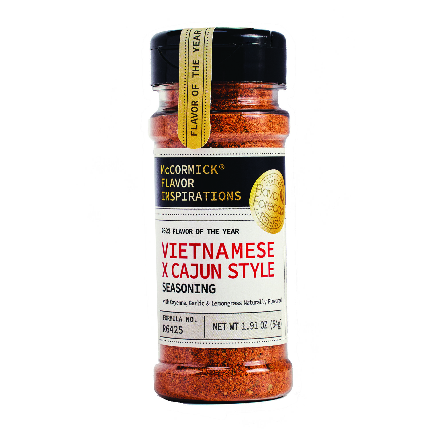
My Role: Design Manager | Agency Partner: DAVIS
Company: McCormick & Co.
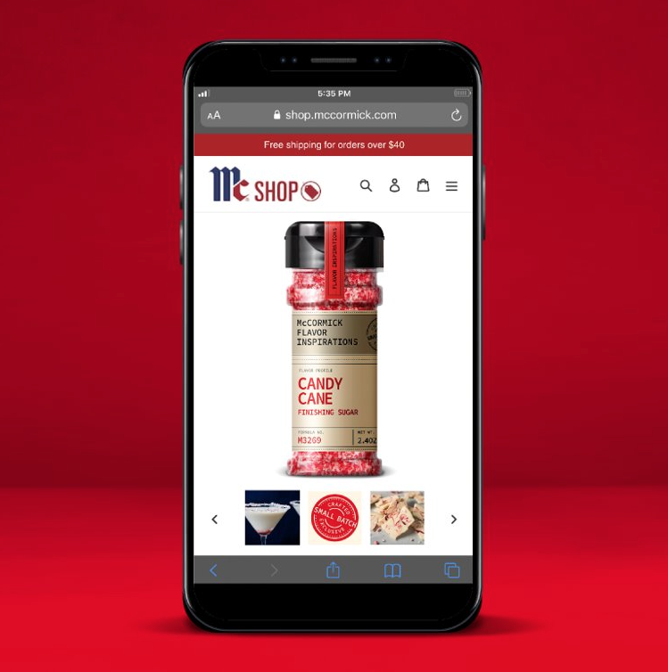
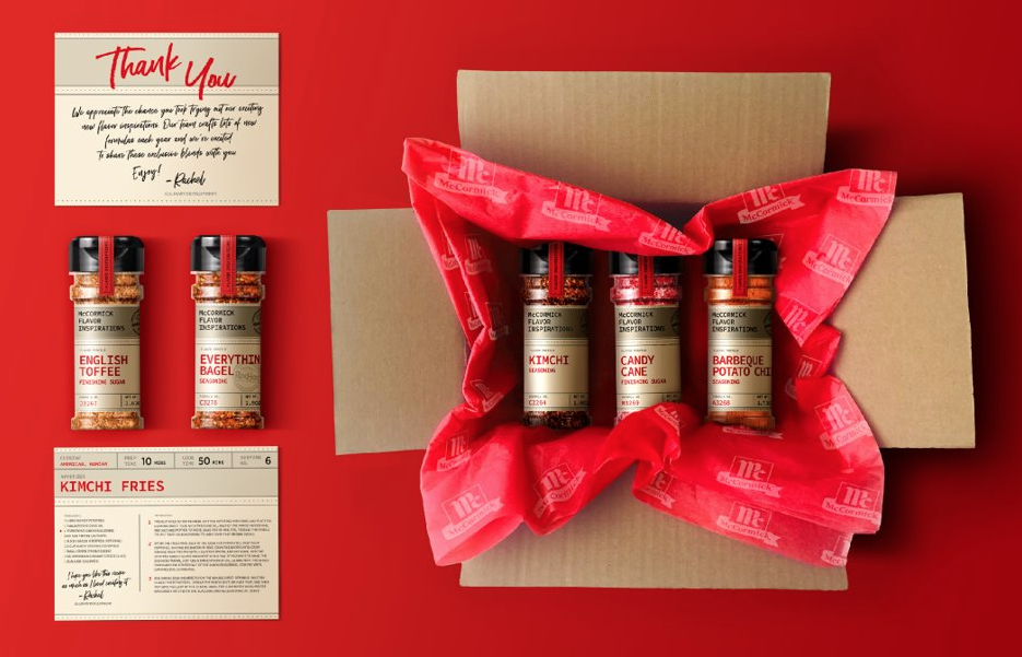
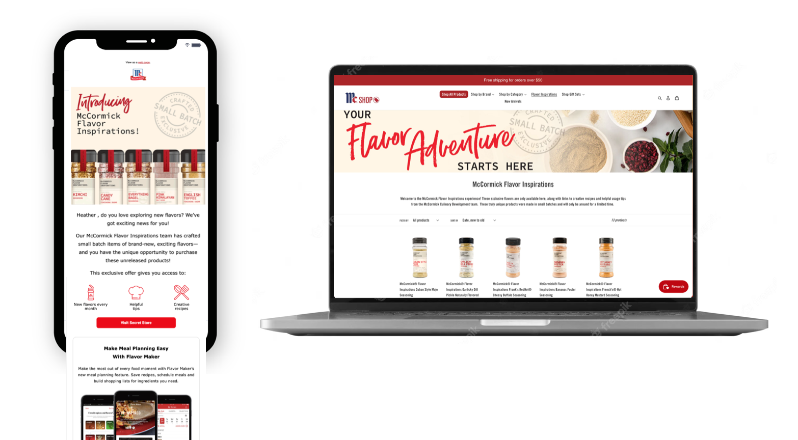
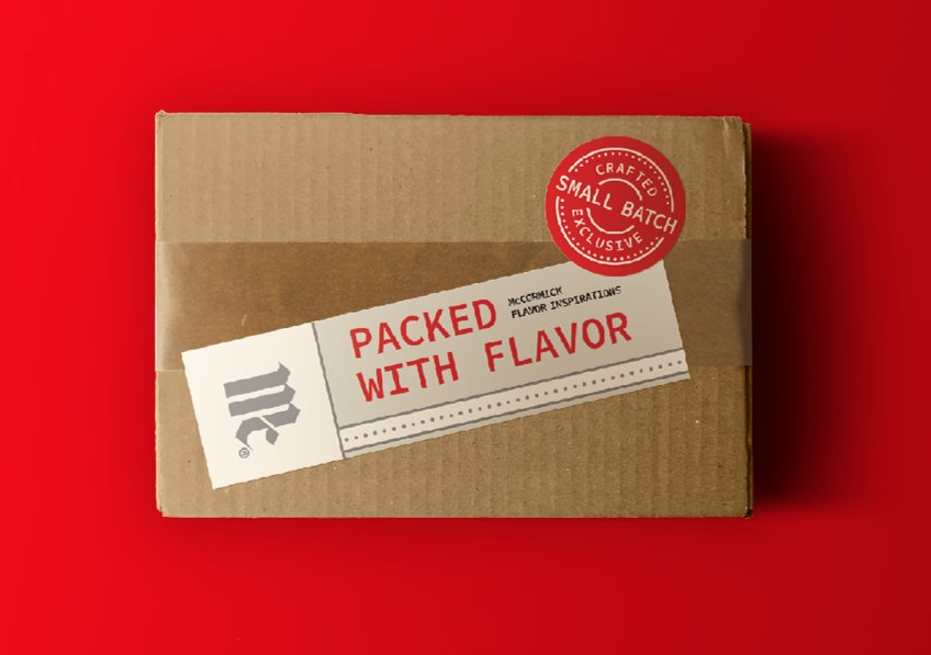
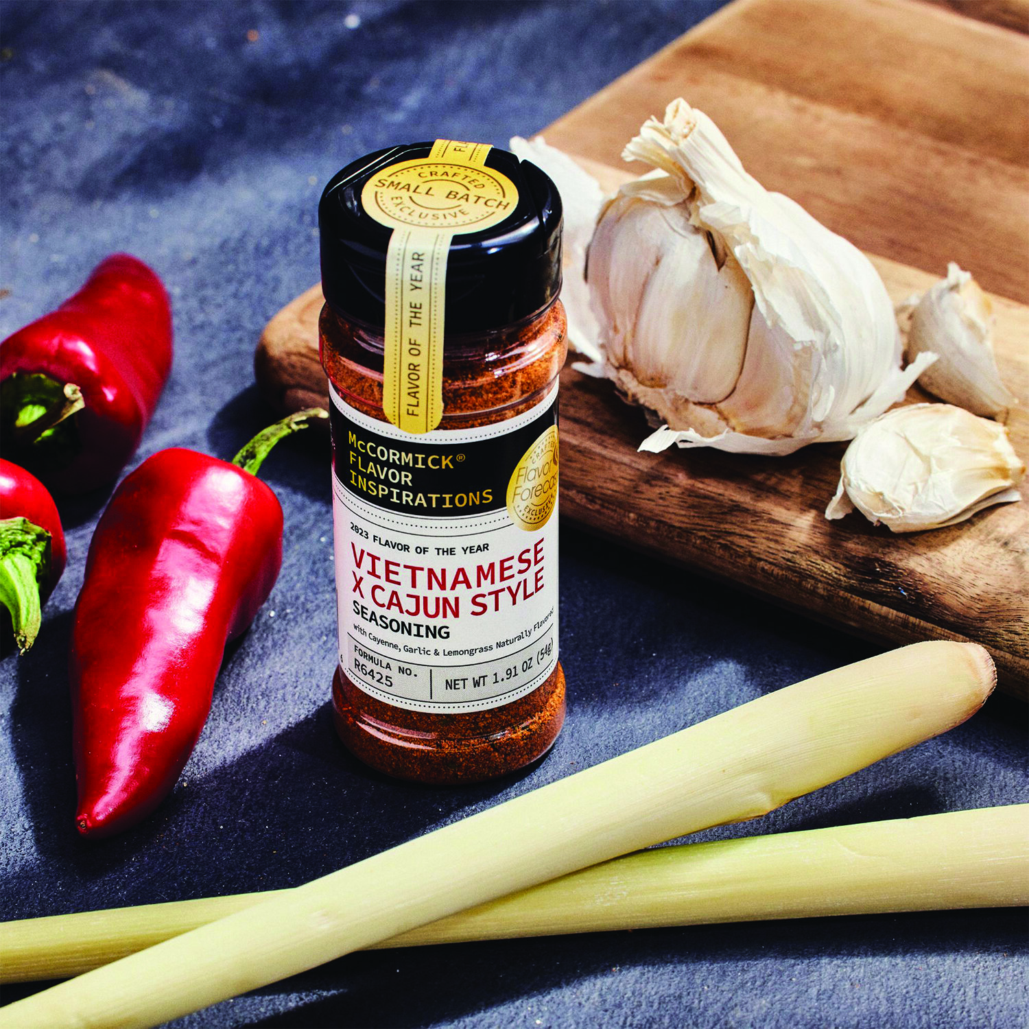
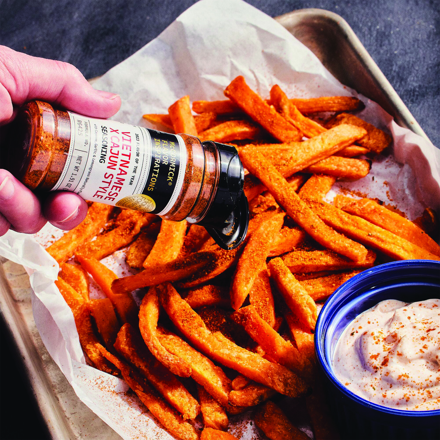
Insight: How do we get flavors out to test faster with consumers?
Solution: Our design team was tasked with creating a design system for our iconic masterbrand that felt like we were bringing new test flavors straight to consumers from inside our spice kitchen. The design needed to also be easy to execute in quick, turn-key manner so we could cut short our standard 18-month commercialization timeline to get to consumers faster. This was our first complete experience, where we would sell directly to consumers from our website and rotate flavors out seasonally.
My Role: Design Strategist & Creative Director
Agency Partner: Bridgemark Agency
In-House Design Leads: Kate Doherty & Meg Farnan
My role as a creative leader within the Institutional Marketing organization is to drive change through design thinking and coaching on agile methodologies. Below are a few of the ways my team of 13 achieved this.
My Role: Associate Creative Director & Design Strategy
Art Director: Madison Schreyer
Copywriter: Danielle Koch
Company: HAVAS helia
Insight: By applying a modular, more strategic planning approach to existing email templates and creating dynamic templates that proved our data driven approach could positively influence inbox engagement.
Solution: We used a prototyping exercise and collaboratively brainstormed with the client and agency teams to create a modular approach that combined all the different messages as variables. The client was left with a new enterprise marketing process in place that bridged the gap between their marketing and e-commerce initiatives.
My Role: Associate Creative Director
Art Director: Madison Schreyer
Senior Graphic Designer: Marissa Grotte
Copywriter: Danielle Koch
Company: HAVAS helia
Insight: How might we give consumers the ability to engage and explore the many flavors Mike’s Hard Lemonade offers?
Solution: As the campaign unfolded, the website’s purpose became clear : to deliver a more fun online experience that was filled with opportunities to connect and engage with the user. To give them the ability to explore and find the product they wanted and to engage with the new flavors and other promotions the brand was hosting.
My Role: Associate Creative Director
Art Director: Lexi Timoll
Copywriter: Danielle Koch
Company: HAVAS helia
Insight: Shopping for insurance can be overwhelming when there is so much to sort through. How might we make the experience easy, personal and bring the cost savings to the consumer?
Solution: From UX design to email execution, the team helped Liberty Mutual optimize their consumer journey every step along the way. Thanks to our data mining team, we were able to test a variety of creative elements, from which headlines work best to how many CTA’s is too many CTA’s. Every test performed met the same standard for high-quality creative design, so even when a test “lost,” it was still a win for Liberty Mutual.