French's Rebrand
My Role: Design Manager | Agency Partner: Bridgemark
Company: McCormick & Co.
Insight: How might we update the design system to reflect the brand promise of the simplest ingredients?
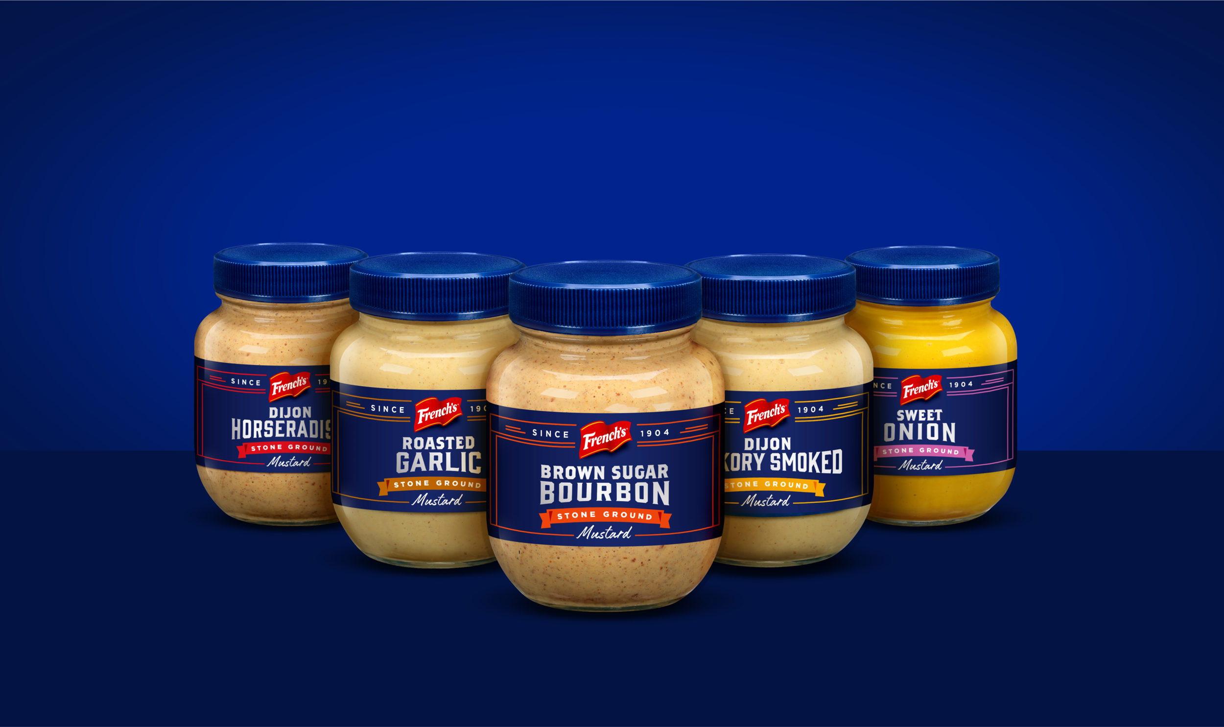
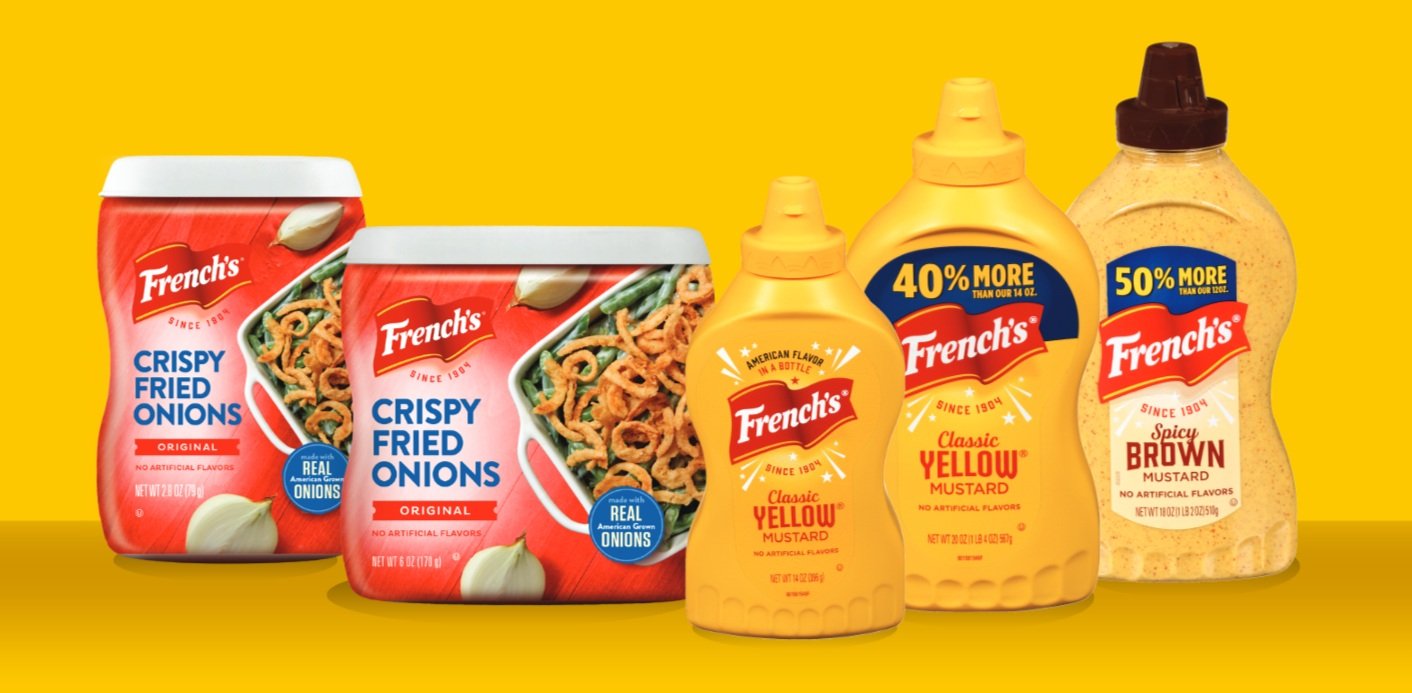
Solution: We started by simplifying the logo, typography and claim choices we included on the front of pack and across omni-channel communication. French’s is known for it’s simple ingredients and bold flavor, so we created a design system that embraced the brand. We applied the design system first at the shelf across the family of products and then throughout advertising and retail media. Last, we worked with our global network to share the design system across the world. Our impact at the shelf won a Nielsen Bases Design Impact Award for increased purchase intent.




Insight: What’s the worst part about mustard? The icky, watery mess that comes out if you don’t shake the bottle. Consumers hate that and soggy sandwiches, so we set out to solve both!

